
Organically growing my site to 3,500 Views a Day
The changes I made over 24h to take my site from 300 views to 3,000 a day. Learn about UI Design, Optimizing conversions through a User-Flow Diagram, and collecting high-fidelity information from users!
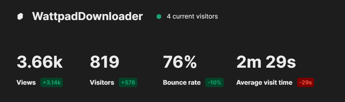
It took 10 days for this website to garner 3.5k views. One day later, I was getting 3,500 views a day.
What happened between the 10th and 12th? Let me explain:
I took a nap. Sleep is very important and I'll be sleeping 23/7 as it increased my developer efficiency 999x.
10x Developers need MBPs & Lattes.
999x Developers just need sleep.
Now, the second half of this secret strategy.
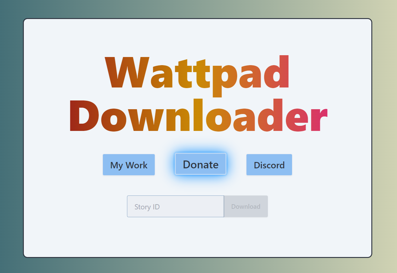
WattpadDownloader is a small site I made for personal use - to download books onto my Kindle. I created a Reddit thread but didn't think much of it till my bandwidth use skyrocketed.
To figure out what was going on, I started tracking analytics for all sites on the domain. To my surprise, other people were using the site!


The question is, why did the site blow up overnight?
Find your target audience
This was due to sheer luck. Wattpad Users who don't like ads, like archiving data, and who are mildly technical - That was my userbase, my reddit thread on r/datahoarder and EReader subreddits aligned to these users perfectly.
For you, visualize who your ideal user would be. What sites would they visit? What channels would they watch? Who would they follow? - If you know where your user is going to be, you can put yourself there to appeal to them.
UI Design
After the initial 11 days, a look at the statistics revealed that 80% of my users were using their phones.
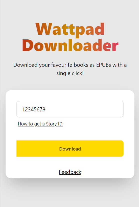
The original version wasn't mobile-friendly at all. Nir Eyal's Hooked says Easy Behaviours get Repeated. Making the site pleasant and useable on mobile devices became a priority.
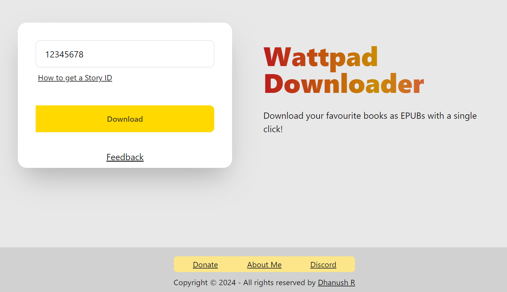
The responsive approach allowed the site to look great on all kinds of screens. The site reflows to place the header above the input on a smaller screen.
The lesson is - By analyzing our initial users on the site, we can refine our understanding of the target userbase. I didn't expect mobile users to use my website, but the analytics painted a different story.
If you're interested in having detailed analytics for your site, I'd be glad to set that up for you! Reach out here.
The more we know, the better we can respond. Bad Site Design was a pain point for my users that I couldn't have realized without analytics.
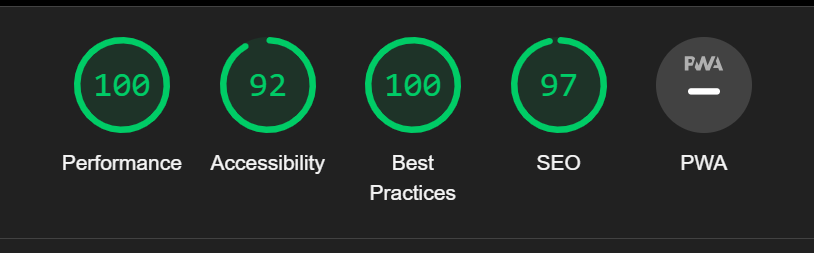
Optimizing the site also led to a great Lighthouse score!
Talk to your Users
You likely noticed the small feedback button, it's a widget powered by FeedbackFish.
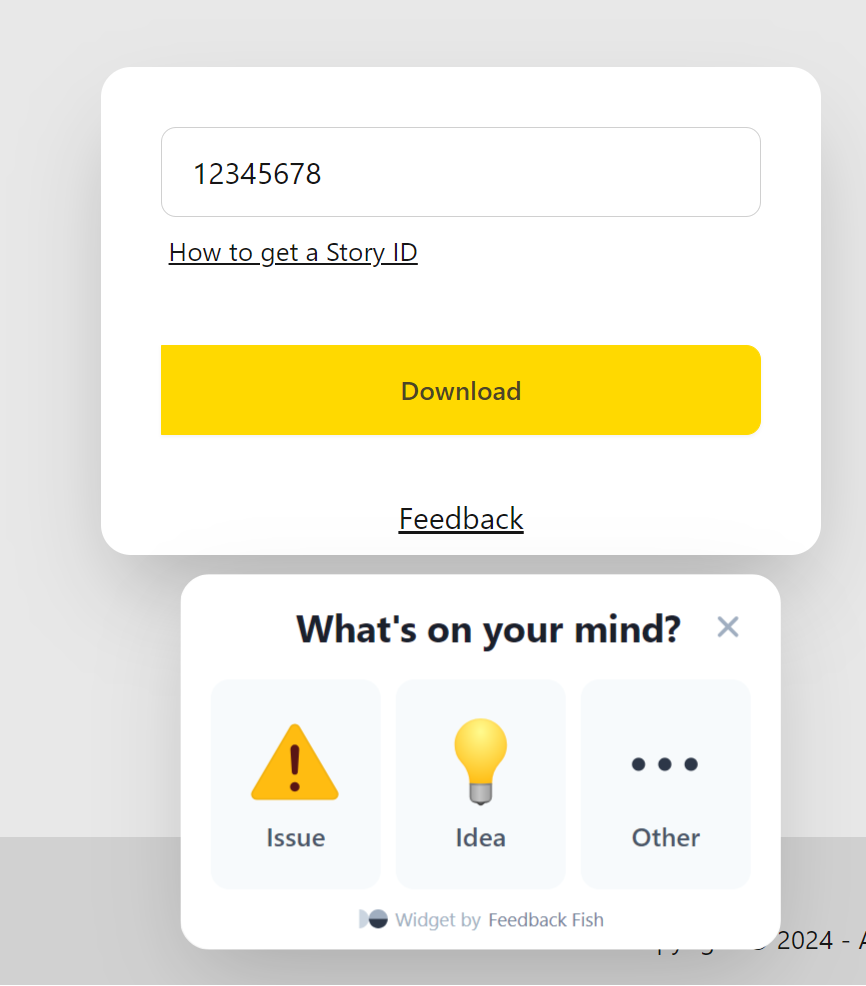
This was simple to add thanks to their two-line integration, and as soon as I put it up, I started receiving feedback!
Users shared issues they were facing, I also received plenty of appreciation! High Fidelity information, the kind you only get from users, is the most valuable data.
They're the ones using the app, they know it best.
You can implement something similar in your application using a Feedback Widget, or by rallying your users into a community. Discord, Slack, Matrix, make a platform and ask users to join!
Timing
Our aim is to reduce friction, but we also need the User to see things that they didn't expressly visit the site for.
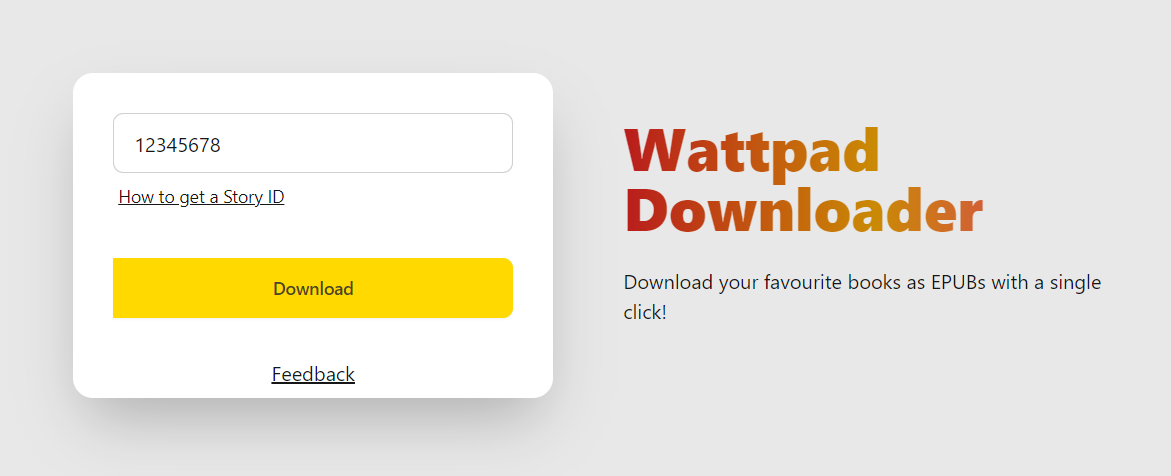
These Users want to download books - Feedback forms and links to communities are annoyances. This picture is my UI from before the update, I'm not proud of it.
For a great user experience, and a great conversion rate, we want to catch the user's attention when they're most prone to accepting (it's like asking your parents for something when they're in a good mood).
How do we do this? A User Flow Diagram.
If you're interested in finding insights through a User Flow Diagram, I'd be glad to help! Get in touch here.
The user flow diagram gives us an insight into how users can traverse our platform. WattpadDownloader's Users select a book, and hit download.
Case Study 1 - How does a User download books?
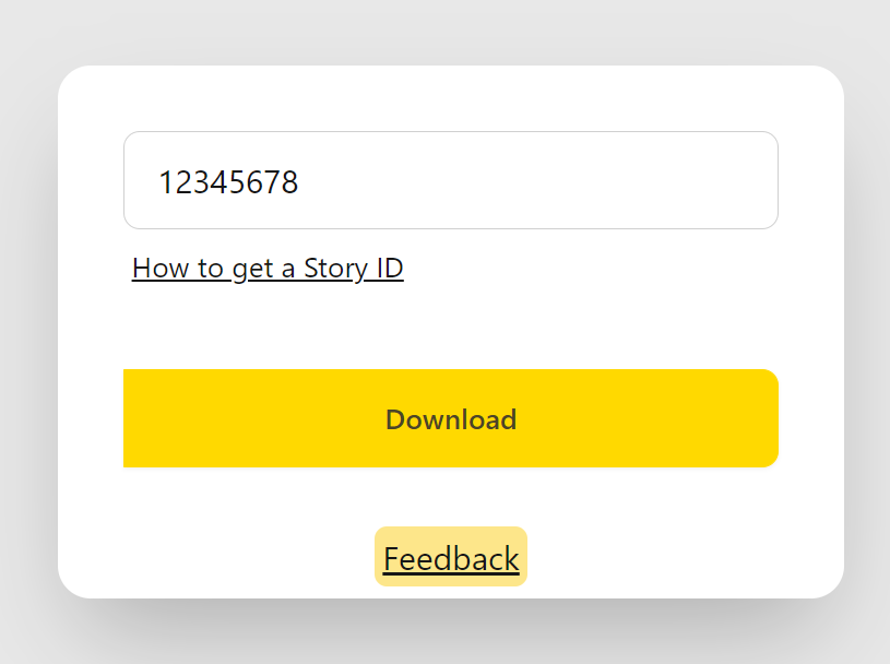
Common feedback revealed that some users had trouble finding the story ID. The new design features a small button below the input.
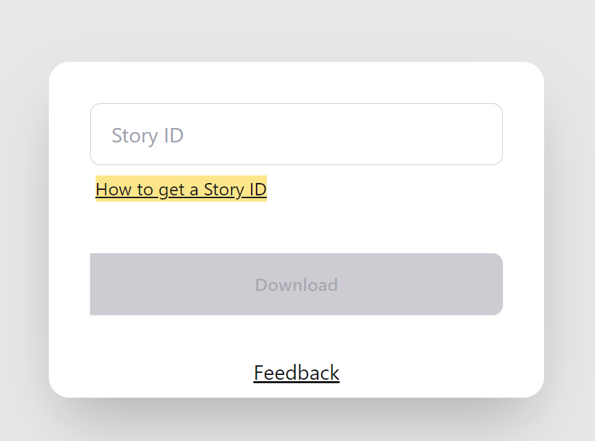
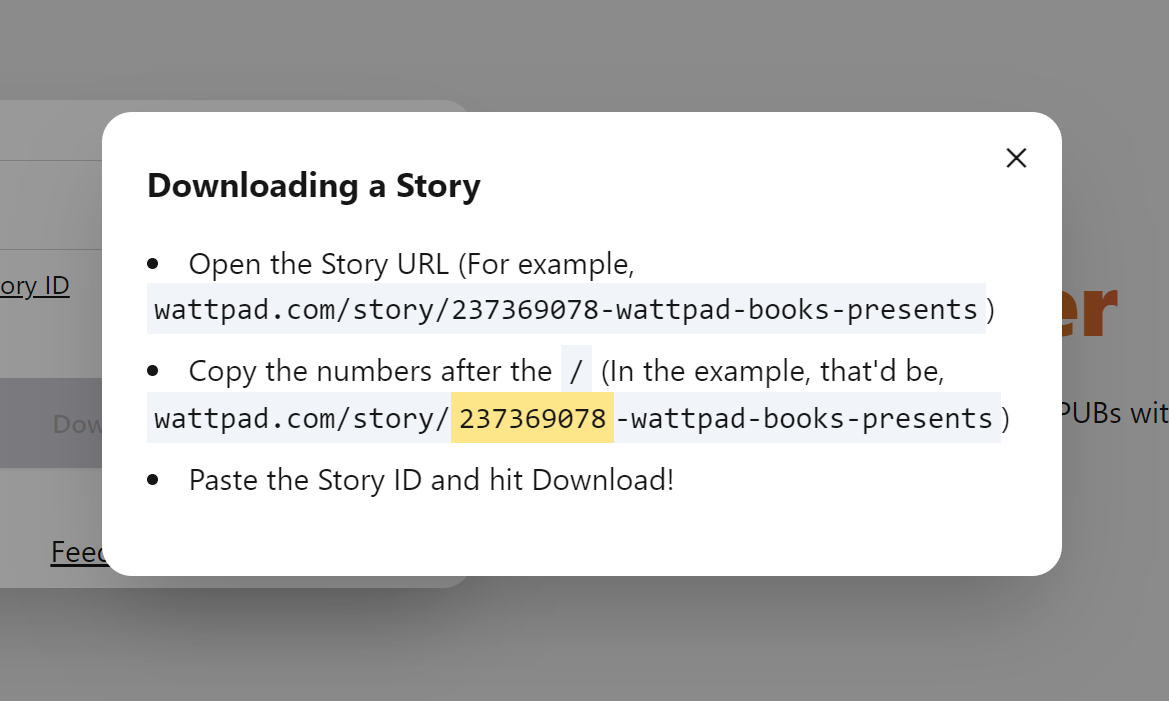
It isn't glaringly obvious, but it's visible to someone who needs it!
Case Study 2 - How can a User support the site?
The User Flow Diagram helped us find another great time to capture the user's attention - The waiting time for a download.
The user spends atleast five seconds on the webpage waiting for the download to process, if we can capture their attention before they switch tabs, we can show them some featured content!
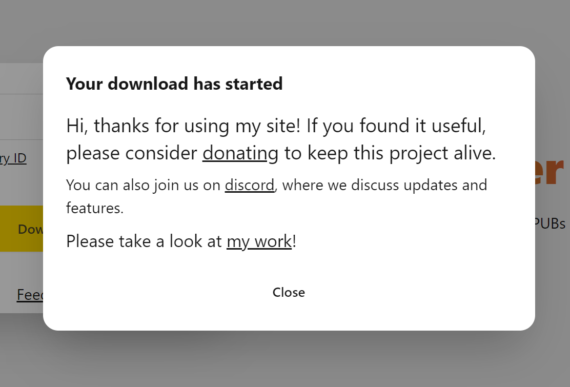
When the User hits download, this modal shows up. This goes back to the "Parents in a Good Mood" analogy, the user is satisfied and waiting for their download.
This is an ideal time to capture their attention and segue into our requirements - Donations, Community, and Clients. All three are satisfied by this modal, these links are also shown in the footer (highlighted).
That's good design! Staying out of the user's way while staying in reach.
Case Study 3 - Offering Feedback
The Feedback button (highlighted) follows the same principle, only a fraction of users offer feedback! To cater to this, it's a small button within the user's focus, but not in their User Flow. The user doesn't have to cross or click the feedback button to continue, it's out of the way, ready to help when needed.
Thanks for reading this post! I hope I was able to share something useful.
I offer many of the services mentioned here - Analytics, Optimizing User Conversions via Flow Diagrams, Web Design, Widgets, and a bunch of other stuff!
We can connect here.
Om